
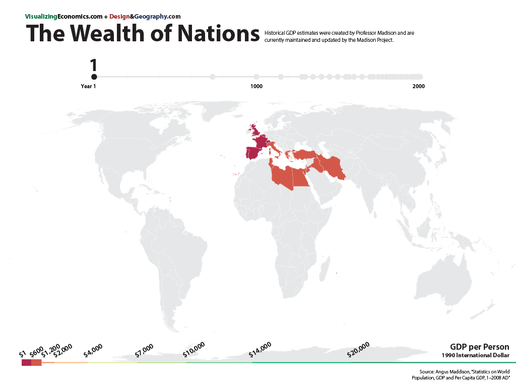
From a series of maps I created (with the help of my urban geographer brother) it is the growth of Europe across 110 years with nine maps. Data is adjusted for inflation.
Data from Maddison Project

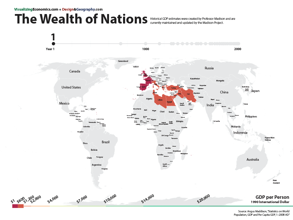
From a series of maps I created (with the help of my urban geographer brother) it is the growth of Europe across 110 years with nine maps. Data is adjusted for inflation.
Data from Maddison Project

Update 3/5/2011: Added labels to y-axis to show US$ GDP per capital (in 1990 dollars)
My new chart takes a look at the very long-term growth of Egypt compared with China based on estimates of their GDP per capita over that last 2000 years. (I am including some of the major ruling dynasties for Egypt and a few world events for reference.) They had similar GDP per capita for most of this time period. However, there are three points when they cross 1100 (China surpasses Egypt), 1850 (Egypt surpasses China), 1994 at which point China leaps ahead.
Data from Angus Maddison's website

I am comparing the GDP per Capita of the United States with Japan, India, China, and Indonesia over the last 500 years. (GDP per Capita for each country is in 1990 international Geary-Khamis dollars, calculated from purchasing power parities (PPPs) of currencies and average prices of commodities.) Data estimates for the population from Angus Maddison Emeritus Professor, Faculty of Economics, University of Groningen.
After coming across this graph about the share of world GDP (China, India, and US), I started to wonder what was the percentage back to 1500? The graph below shows the share of GDP over the last 500 years for China, India, Japan, Latin America, Western Europe, and United States. (Keep in mind that the change in population size will effect the size of the GDP)

Data estimates for GDP from Angus Maddison Emeritus Professor, Faculty of Economics, University of Groningen.
See also:
